ASSIGNMENT:
- This project is about using data visualization models and imagine them as modules to navigate through social media content.
- Illustrate how to increase user retention through relevency.
- Illustrate how to increase user exploration of new content.
- Illustrate how to increase user engagement of content.
SKETCHES
|
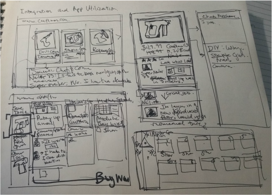
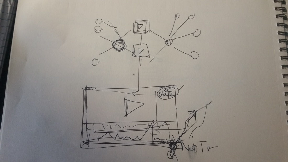
This is an idea of streaming content relative to the products selected from the client site.
In this screen there is a nail gun being selected by a customer on the Craftsmen site. This will propagate DIY social content related to that product and bring in more content about that product such as comments, tweets, ect.
|
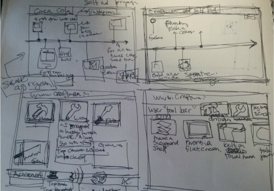
This is a sketch on using comment achievement to give users encouragement to explore, share or retweet.
The achievement mechanic will give endusers gratification though a game mechanic. Reward users for duration, sharing, retweeting. It gives them ranking, unlock badges.
|
|
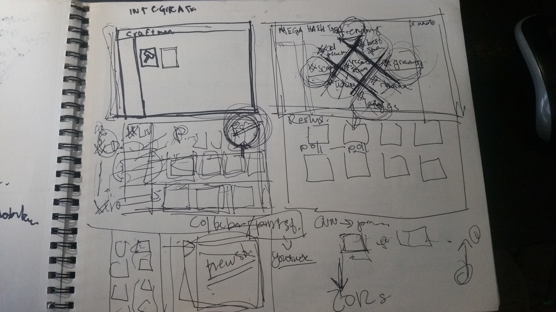
A tag modifer tool organized around a giant hashtag. Just an idea that I quickly abandoned
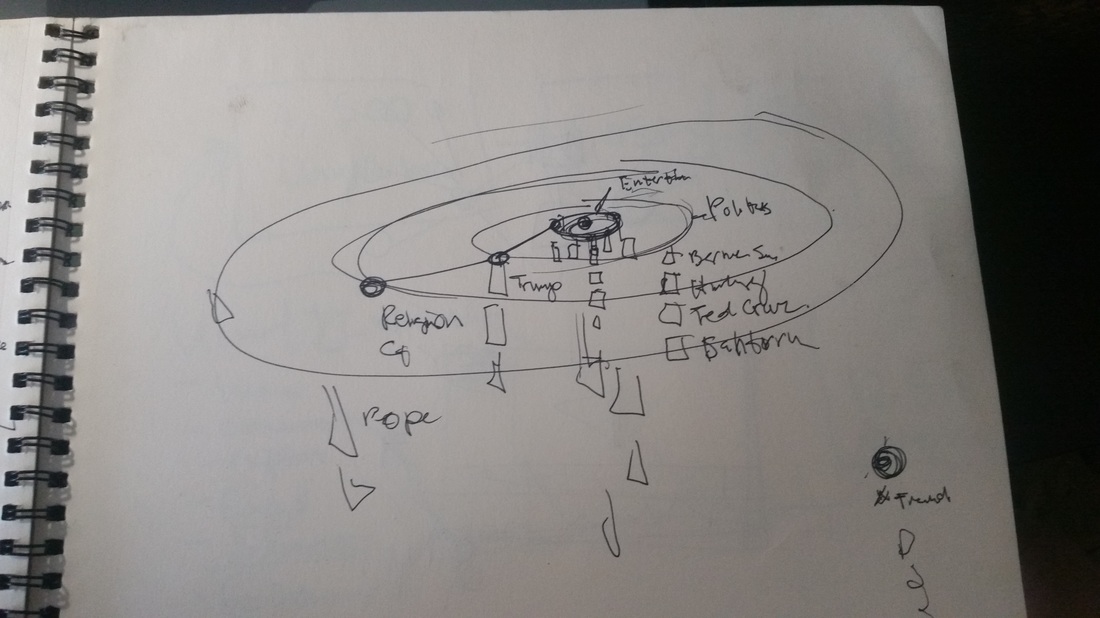
This is a solar system model that organizes content into rings.
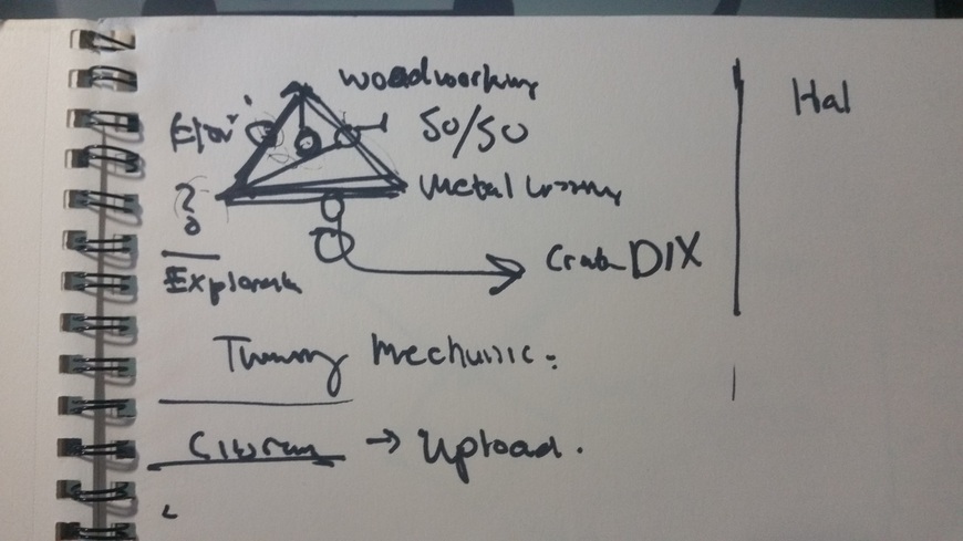
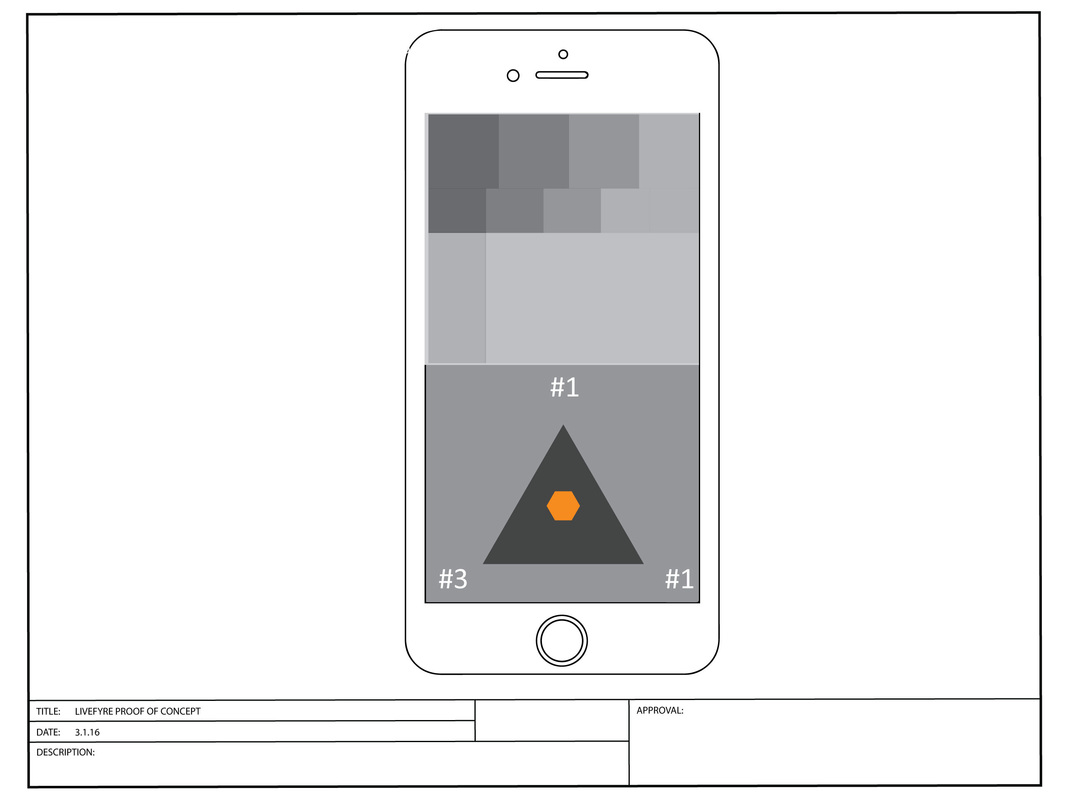
This is a sketch of my triangle module before my digital recreation.
|
This is the first sketch of the directly model
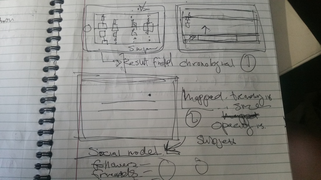
Notes listing all the models.
|
FILTERING FOR RELEVANT CONTENT
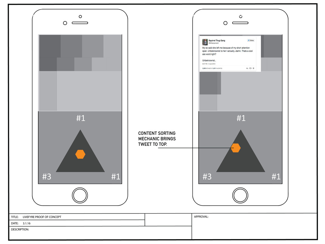
1. NAVIGATION MODULE
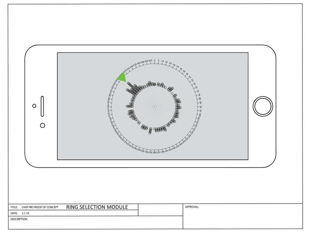
2. RING SLECTION/NAVIGATION MODULE
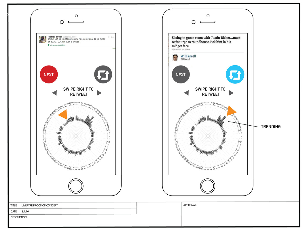
Here we have content listed around ring module. The user can use gesture controls like dragging around the ring. Magnitude of some of the content indicates what is trending. This model is pretty easy to use and understand. I can already imagine using a right or left swipe for sharing and liking or passing to the next post.
UPDATE 3.4.2016
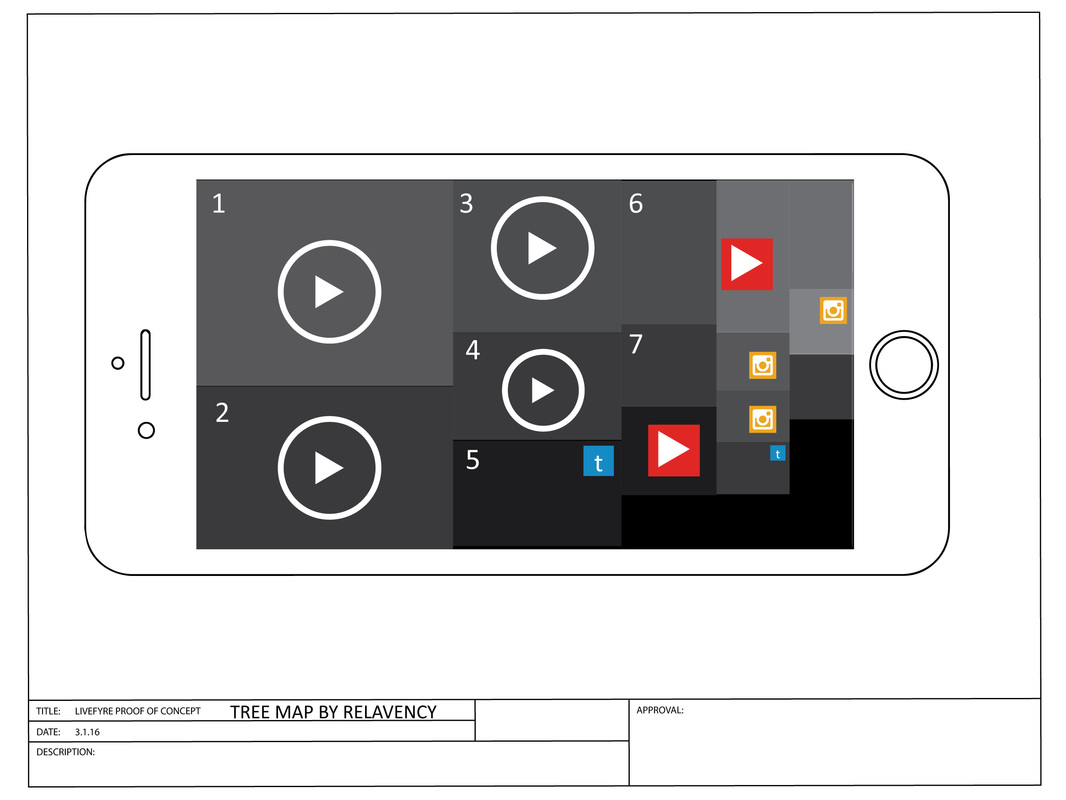
1. TREE MAP MODEL
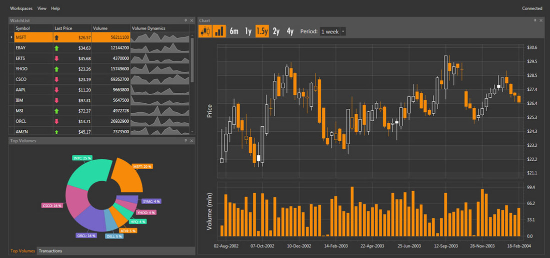
DATA VISUALIZATION IDEASA treemap combined with a filtering mechanic could be pretty engaging. Its faster and less complicated then my time line model.
|
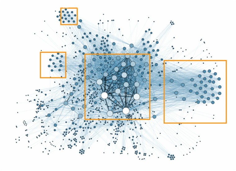
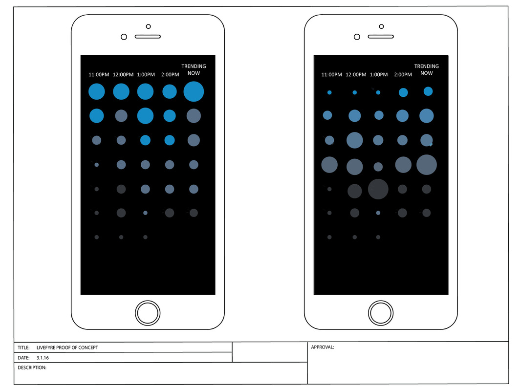
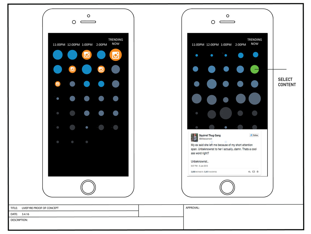
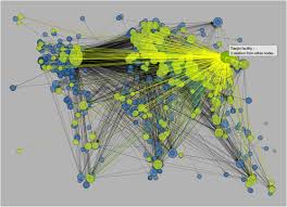
2. CLUSTER MODELThis cluster map inspired me to think of a way users can grab content that is most relevant to them. Here, we can use size and opacity to indicate relevancy and is easy for allowing the end user to choose what is most relevant to them. Size also allows for mobile users to easily select which content they might want to see. We make the content that is most relevant large enough for mobile device selection and everything too small to touch is considered irrelevant data. I imagined having the content that was not relevant could be hidden away or faded into the background it would This image was found with the wikipedia entry for data visualization models.
|
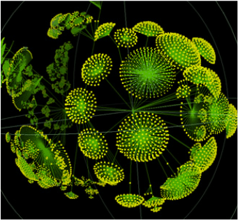
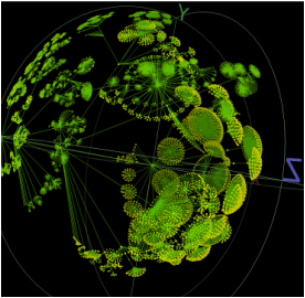
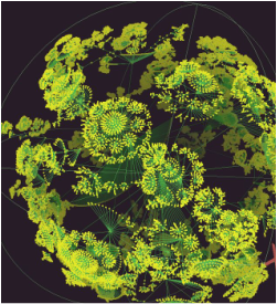
3. DIRECTORY TREES
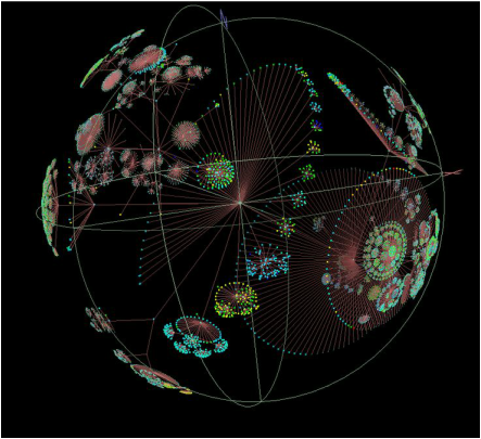
These are directory tress. I think this is a good way for end users to "control" and navigate through trending content by arranging them in clusters that can be grouped into a sphere. This can act as a module on the cellphone allowing users a way to navigate and still have many indicators where their search is in relationship to what is trending.
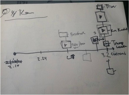
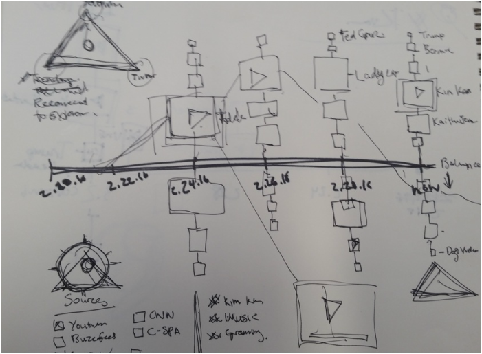
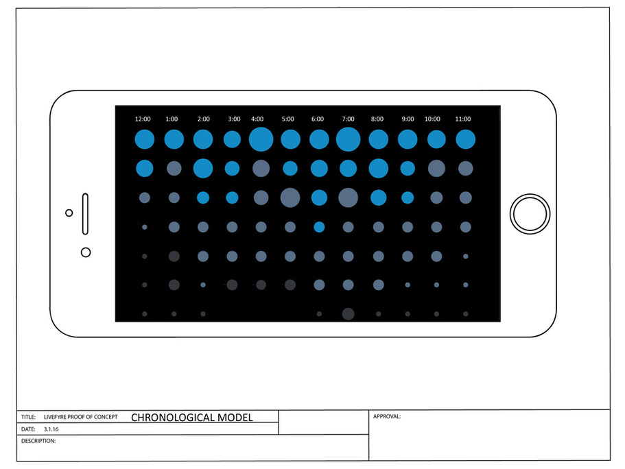
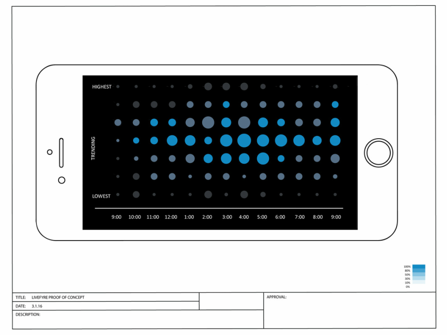
4. CHRONOLOGICAL MODEL FOR TRENDING
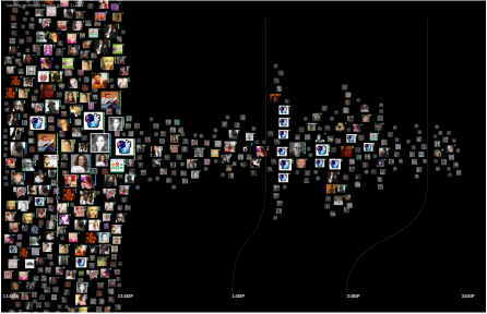
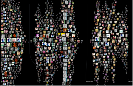
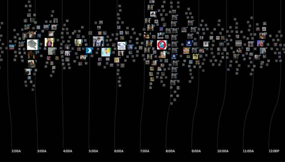
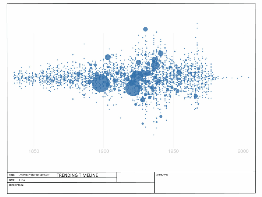
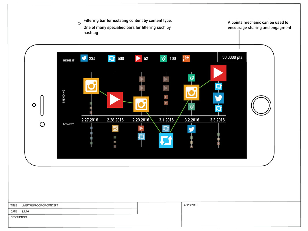
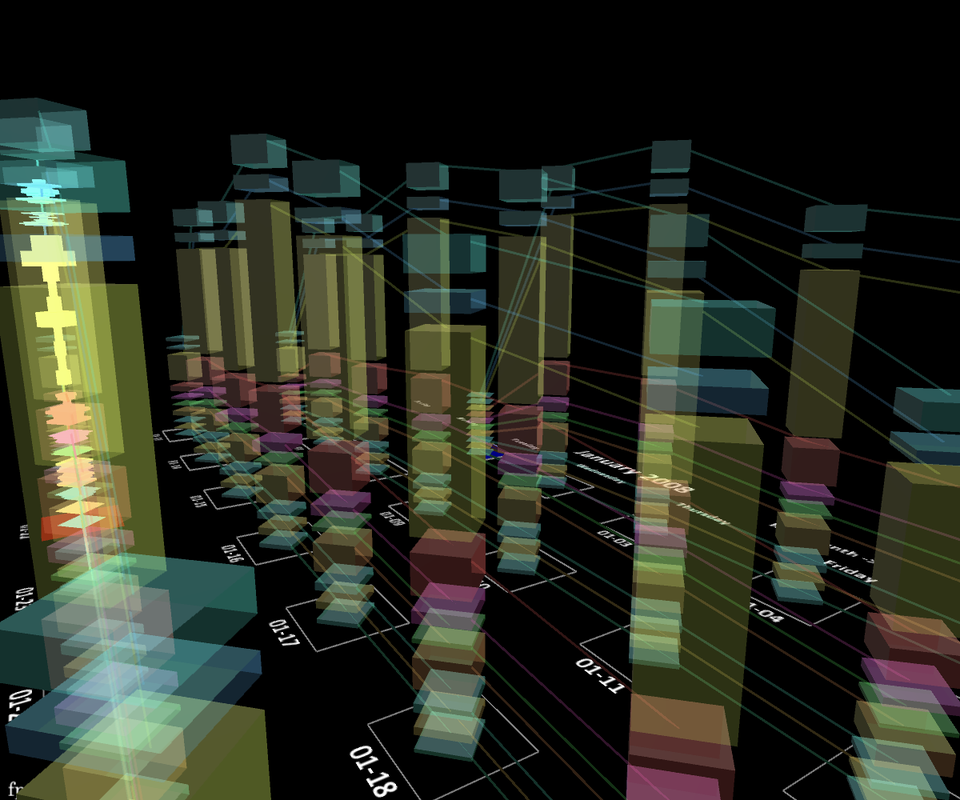
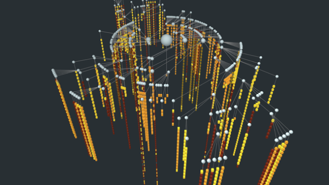
Moritz Stefaner has a site on data visualization of social media. I can immediately see this as a dashboard for a chronological ordering of what is trending. The content that is larger will be more relevant to the user. The content that is faded through opacity will not be. The top of the chart could be what is trending the highest and all other content will rank below it. I have placed the link to Moritz Stefaner's work below.
This lead me to make an upgraded model that not only ranked trending media in height, but also used size and opacity to indicate the relevancy of the content. This is my wireframe representation of this model
UPDATE 3.4.2016
REWARDING ENGAGMENT
Systems for rewarding engagement and feed back would be important. I like the idea of gaining experience points and given points for sharing, liking, retweeting or just being on the app. Anything that bring the user back to the client and boosts their social presence will give the user more points.
Users achieving points will be able to unlock achievement. (banner animations)
Users will be able level up.
Users will be able to draw social media back to their social presence.
Users can trend themselves.
Users will be able level up.
Users will be able to draw social media back to their social presence.
Users can trend themselves.
PROJECTIONS
- Detailed Wireframes with complete user flows ~120 hours (as fast as ~80)
- Complete Visual skin matching Livefyre's ~40hours
- Styleguide~ 20 hours
- GUI native front-end development (will get estimate) I have a developer I work with who is very fast but only a CSS front developer.
- Backend support (will get estimate)
- Projection in ~2.5 month
FEEDBACK
I spoke to several friends in the design industry. One of them is a head of Engineering at Intermodel, a big data company. He was also did data visualization for Morgan Stanley and Chase and another data scientist for the world bank. They feel my designs are bit complex. As an end user, they would be more interested in the simplified solutions like modules for navigation. The more complex designs would would be more interesting to use the complex visuals for a super user dashboard to monitor behaviors of the end user.
REFERENCES
Google Analytics Summit 2013
