C.A.T. LOGO DESIGN
Logo design is something I don't do enough of. Its really challenging and rewarding when I do. The identity and branding in the imagery has to be spot on. I am particularly proud to work on these logos for former Amphibious Reconnaissance Marine Sgt. Carlos J. Aguilar. He runs a wilderness survival training experience for law enforcement and clients by drawing from his training as a Recon Marine. Some of his clients include the California Highway Patrol and Urban Shield. His program is called C.A.T. (Carlos Aguilar Tactical).
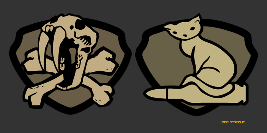
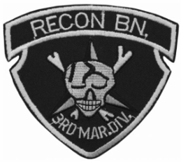
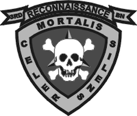
There were some design requirements that Carlos requested to be implemented. First a visual connection to his military background. I choose to go with a rounded version of the 3rd Reconnaissance Shield due to him serving in this division but still have enough clear distinction from his USMC trademark. Second obviously needed some sort of cat to represent his acronym. I choose to use a saber tooth skull instead of the the skull and crossbones and then stylized it to be a bit more edgy. I used rudimentary vector shapes and colored it black and flat dark earth to represent the colors Carlos tends to paint his gear and weapons.
The kitten on a bullet signifies a novice level C.A.T. trainee. Carlos expressed much gratitude and loved the logo for its playful nature and still had the gritty feel he was looking for. I created this in 2011 for him. A couple years later he got a tattoo of my illustration on his chest.
The kitten on a bullet signifies a novice level C.A.T. trainee. Carlos expressed much gratitude and loved the logo for its playful nature and still had the gritty feel he was looking for. I created this in 2011 for him. A couple years later he got a tattoo of my illustration on his chest.
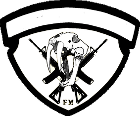
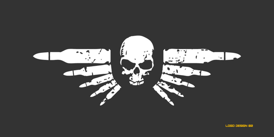
This is another direction I explored in the logo design that centered on the skull that was significant to the USMSC shield. I felt it was a bit dark and didn't have any ties to the C.A.T. acronym. This was before the training experience was named C.A.T.
