HEALTH 2047/ THE AMERICAN MEDICAL ASSOCIATION
In the fall of 2016 I began working for the American Medical Association's start up, Heath 2047 which is looking to create an app that would allow doctors to message their patients and edit the electronic medical record of their patients from their phone. We had a partnership agreements with a few electronic medical record companies, however the scope of this project seemed to have a risk assessment the AMA did not want to invest in based on its return. Regardless, I am proud of the work we did. My responsibilities were to plan out the user flow, create style guides as well as specifications for the developers in collaboration with my director, Will Hall.
For the purpose of this project, it would hard to indicate user design stories as we didn't put this in the hands of end users and but this project was interesting because essentially our stakeholders were the users initially. The board of AMA investors didn't know much about tech development but they are doctors which make them ideal candidates for focus group testing.
For the purpose of this project, it would hard to indicate user design stories as we didn't put this in the hands of end users and but this project was interesting because essentially our stakeholders were the users initially. The board of AMA investors didn't know much about tech development but they are doctors which make them ideal candidates for focus group testing.
USER FLOWS
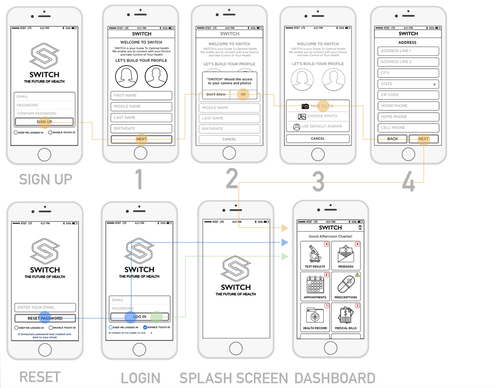
Planning the user flows were just sketching out boxes in a white board. It often started out as looking up the best login practices of iOS and Android apps. However once you find a UI mechanic, then you have maintain the metaphor through out the all the use case and the entire product. Adding new features and having them fit the same metaphor was repetitive but ultimately made the design more intuitive and easier to use.
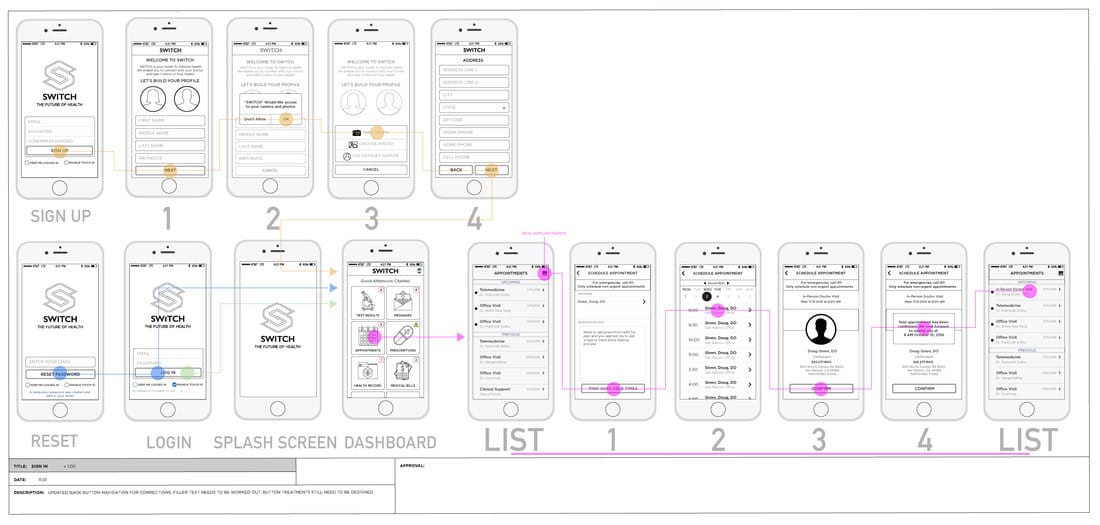
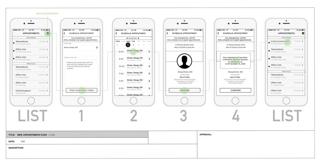
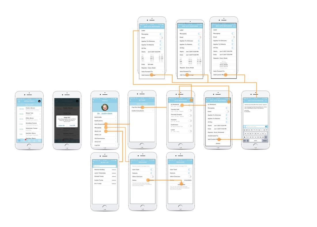
Here we have the user flows for a physician or practitioner to set automated responses for when he was away from messaging which directed him to the next available practitioner in practice or out of practice or directed the user to call 911 for emergencies. There was even the feature of a practice being able to set an overriding message for if the practice was closed for holidays or renovations.
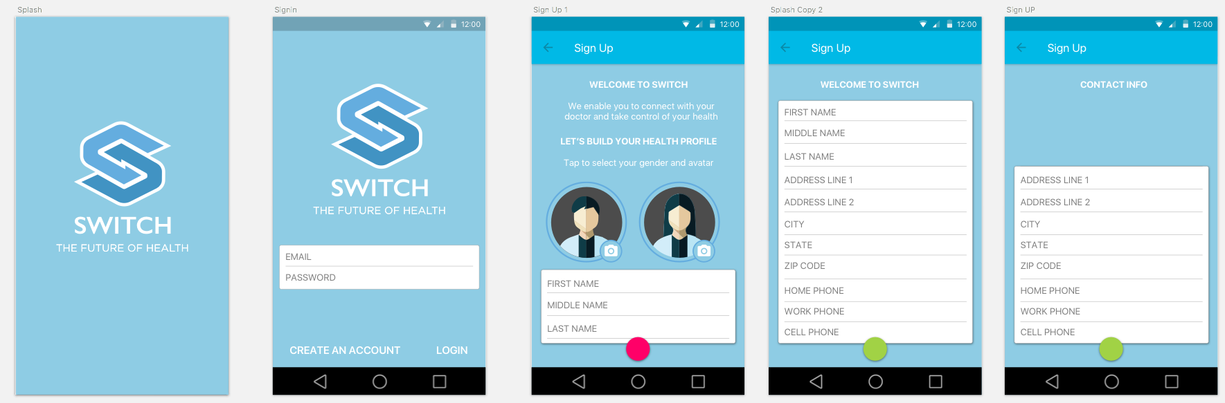
ANDROID VS IOS TREATMENTS
I still try to leverage material.io principals in iOS but there is a certain look and feel I think we expect from an iOS app and a Android App that made me change the pallet slightly, as well as change the spacing and what was available on one screen.
|
|
MATERIAL.IO SPECS