NEXUS
WHAT: A ride hailing app to work in conjunction with the last next generation autonomous shuttle.
WHEN: 2018
WHERE: SAIC MOTORS
ROLE: SENIOR LEAD UI/UX DESIGNER
WHEN: 2018
WHERE: SAIC MOTORS
ROLE: SENIOR LEAD UI/UX DESIGNER
|
|
THE NEXUS SHUTTLE |
THE NEXUS APP |
|
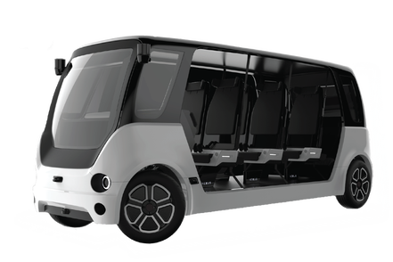
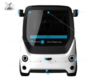
This is a Nexus Shuttle designed at Saic Motors Innovation and Research Center in the summer of 2018. Finally since it's public launch at UC Davis, I get to talk about some of the design challenges. I had the honor of working with a team designed a fully autonomous electric shuttle that can drive up to a 60 mile range. My role was unique as I had to act as the architect, the principle designer, the UX researcher and visual designer. I was tasked with creating the vision as well as lead a team to develop the partner app with this beautiful creation. The designer of this shuttle is named Kai Yang. He wanted to create something futuristic and friendly yet classy and elegant. My vision needed to reflect that beauty.
|
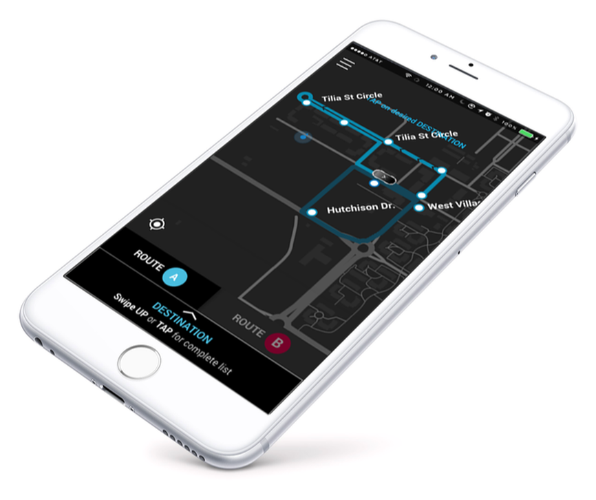
My app had to capture the look so that anyone who had the app could instantly tell these two products had been cut from the same cloth. I wanted the GPS map to have the same contrasting shades between black and white though I was fearful it would become too close to looking like Uber.
I solved this by accenting the routes with bold colors influenced by the NYC metro graphics using colors like blue, yellow, orange, red, magenta to indicate various routes. |
VISUAL DESIGN DELIVERABLES
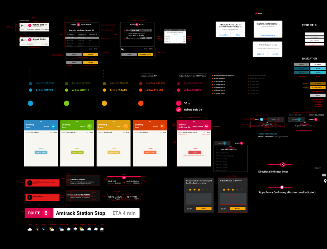
I usually prep in a pluglin spec sheet creator in Sketch but also I create a visual style guide for the front end developers as well.
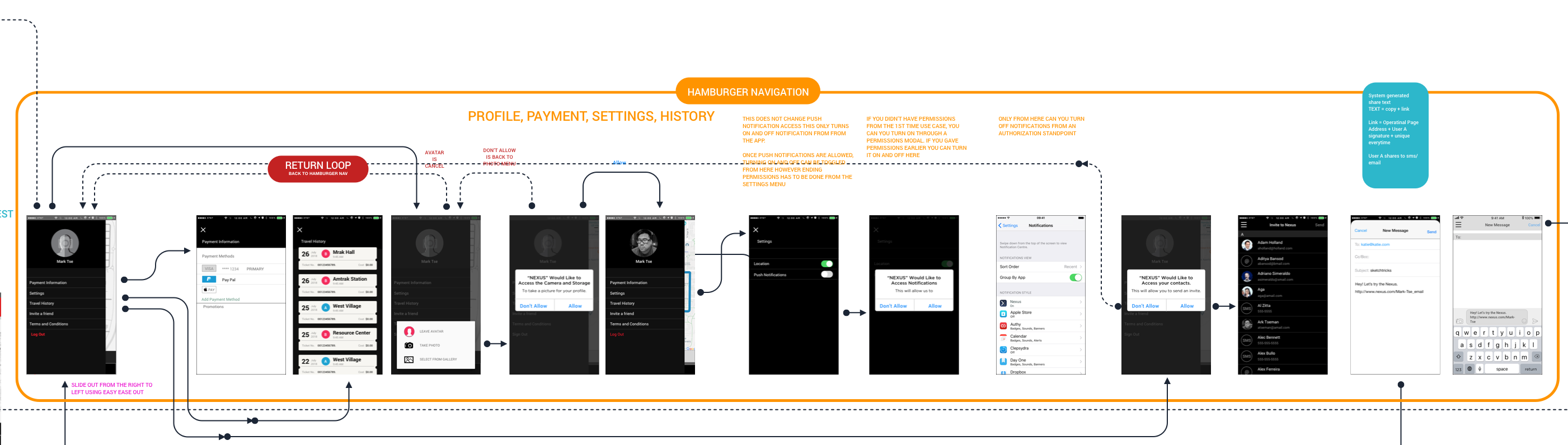
USER CENTRIC DESIGN: FOCUS GROUP TESTING
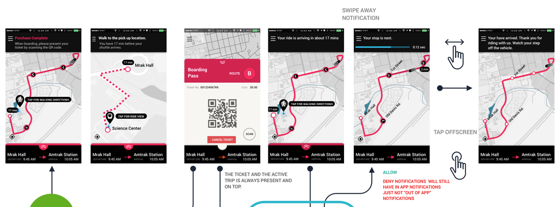
This was my June 2nd, 2018 version of the USER WORK FLOW that I had constructed. If you look at the center you will see a section where i had two options for pulling up the purchased ticket.
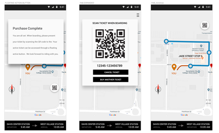
This is the Floating Action Button design at its earliest conception. This expands a QR code as a modal.
|
The second solution is a drag up design meant to look like a train ticket that the user can TAP or SLIDE to expose the QR Code for the shuttle's Scanner.
|
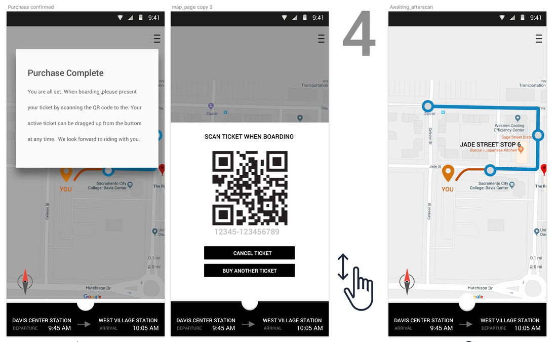
When we conducted our focus group, we had chosen the visual ticket design metaphor. Our test concluded of 24 users, 18 did not find dragging up to be clear and useful.
Our second to last update had all the visual cues to drag upward to pull out a ticket but still after the next blind focus group. Though nearly everyone completed the task with the new visual improvements, we had 19 out of 27 users complete the task in under 15 secs. However when comparing to our Android user base, the Floating Action Button was extremely fast and understandable since the metapho exists for most Android Users. Porting the same mechanical function to iOS in an internal app seemed logical but the results of the test showed that iOS users completely misunderstood the function of the Floating Action Button.
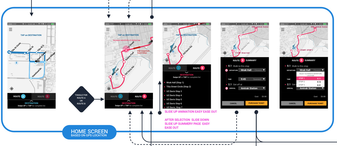
The image above also showed the route of ordered shuttle. By tapping on the User's pin drop icon, the rider can then toggle between the train route and the walking route to the nearest pick up location. Our initial studies showed that 83 percent of the participants claimed they liked and found it easy to toggle between modes and found it obvious from a qualitative standpoint, however from a quantitative study it took users more than 15 secs on average to tap the icon until we had the "TAP for walking directions" message.
The image above also showed the route of ordered shuttle. By tapping on the User's pin drop icon, the rider can then toggle between the train route and the walking route to the nearest pick up location. Our initial studies showed that 83 percent of the participants claimed they liked and found it easy to toggle between modes and found it obvious from a qualitative standpoint, however from a quantitative study it took users more than 15 secs on average to tap the icon until we had the "TAP for walking directions" message.
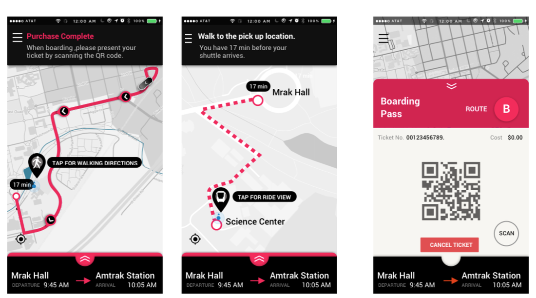
Similar focus tests gave us insight on where to order arrival and departure. The shape and size of the drop down menu. Earlier I had even designed it as a collapsing list that people did not respond well to it.
VISUAL RESPONSE TO FOCUS TESTING
34 small sample interviews of other graphic designers were down the front facing app few different skins and were asked to pair a variety of ride hailing apps in China with our physical Nexus shuttle. The app DiDi was looked at, Uber and Lyft were also considered. The original UI did not pair with our shuttle at all.
Initially the app was blue dark blue, before I had arrived and the criticism was that it was hard to read and see the route. Simply changing the contrast would help with readability but I was still dissatisfied with the overall app look. The focus group was not impressed with the visual look as well.
We conducted the test a new survey to the participants of the usability test by rating their views of the new design and most of them gave our app a positive review..
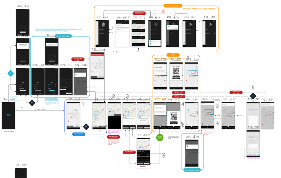
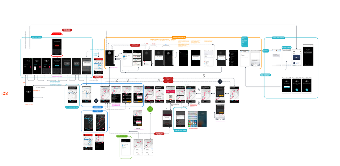
FINAL USER FLOW
|
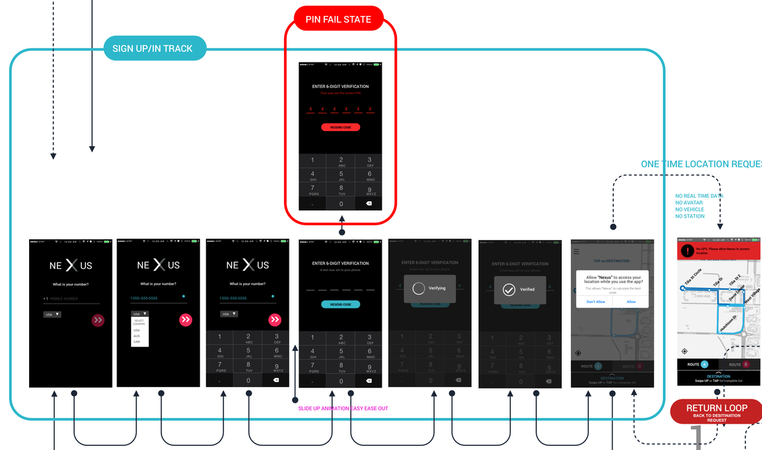
LIGHT BLUE BOX = FIRST TIME LOGIN AUTHENTICATION
RED - FAILED/INVALID INPUT TRACK YELLOW - USER ACCOUNT SETUP, HISTORY, PAYMENT SETUP, PERSONALIZATION BLUE - MAIN UI PURCHASE TRACK GREEN BLUE - REVIEW RATING AND FEEDBACK SYSTEM GREEN - PURCHASING TRACK DEV TIME - 3 MONTHS FOR FINAL VERSION OF iOS, ANDROID, ALONG WITH IN VEHICLE UI TO TELL USER TO GET OFF AUGUST 28, 2018 |
|
Core functionality of ride hailing.

Please feel free to ride a Nexus and if you are a Davis student and have already ridden a Nexus Shuttle, please tell me about your personal experiences with the app.