PRE-SALES CALCULATOR
WHAT: A pre-sales tool visualizing scalable data needs.
WHEN: 2016
WHERE: Nimble Storage
ROLE: SENIOR UI VISUAL DESIGNER
WHEN: 2016
WHERE: Nimble Storage
ROLE: SENIOR UI VISUAL DESIGNER
The sizing tool is a predictive cloud application that leverage advanced analytics to identify future needs in sizing calculation for sales purposes. The platform uses data results packaged by Infosight in a simple narrative to enable users to get real-time recommendations according to capacity, performance and SLA requirements.
My role and contribution was to be a UI Visual designer. I worked with the UX Architect and front end developer to understand the specs from the stakeholder as well as the library and technical limitations. However my forte was the visual design language.
Design tools
Sketch, Illustrator, Photoshop, InDesign
Technology
React, Javascript, Vertica DB, WebGL,
The Final Design
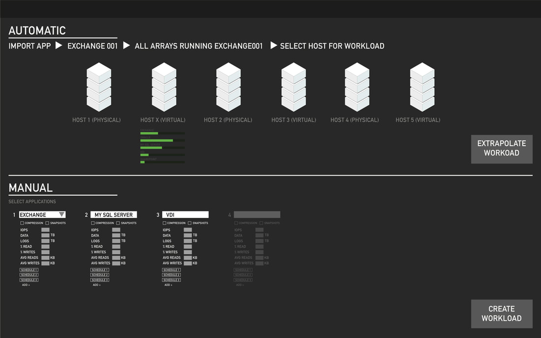
Here the workload can be extrapolated using Cloudascope or manually entered.
- User enters system workloads values manually, or automatically through cloudoscope and the sizing tool displays the applications list
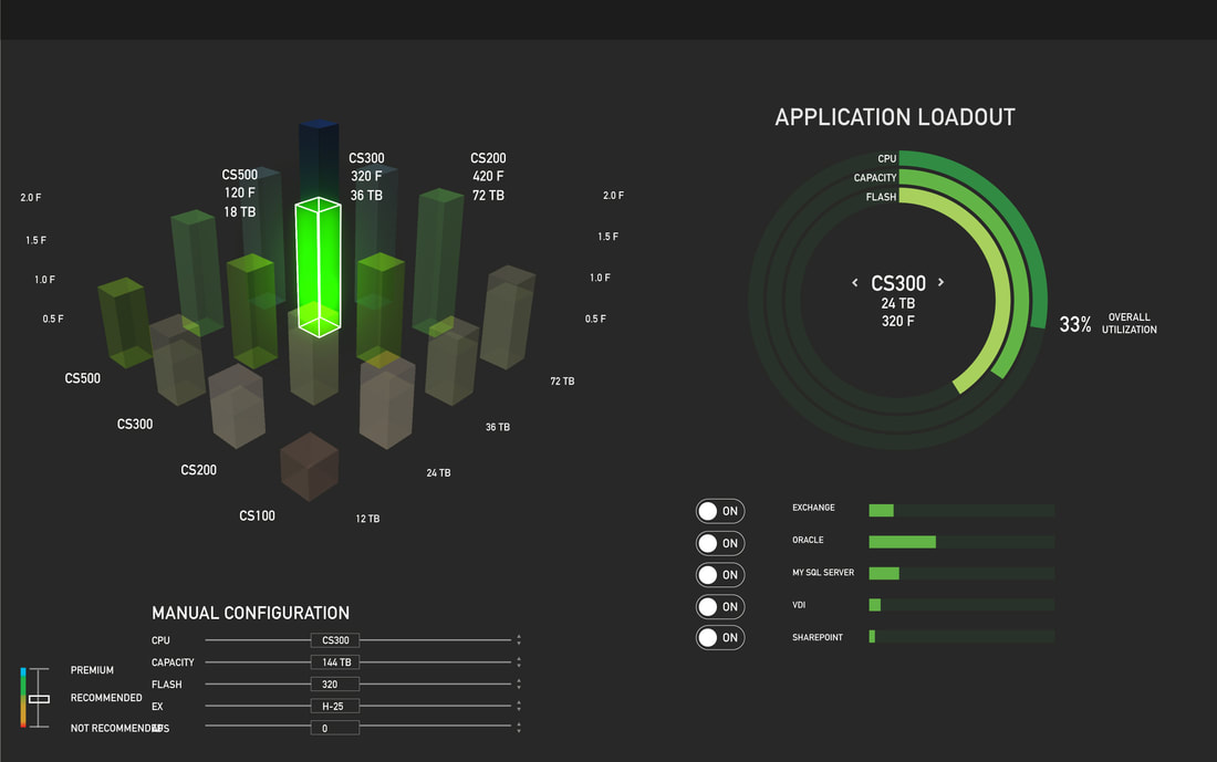
- User customizes application details clicking one application in the list ( application tab turns white and open a customizable tool-tip) . Then the user click "save" and the system returns a set of recommendations displayed in a graph with 3 axis: Capacity, CPU, and Flash
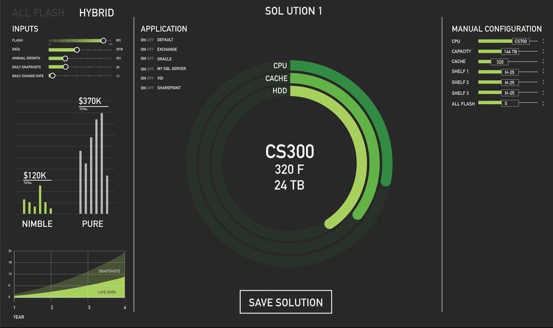
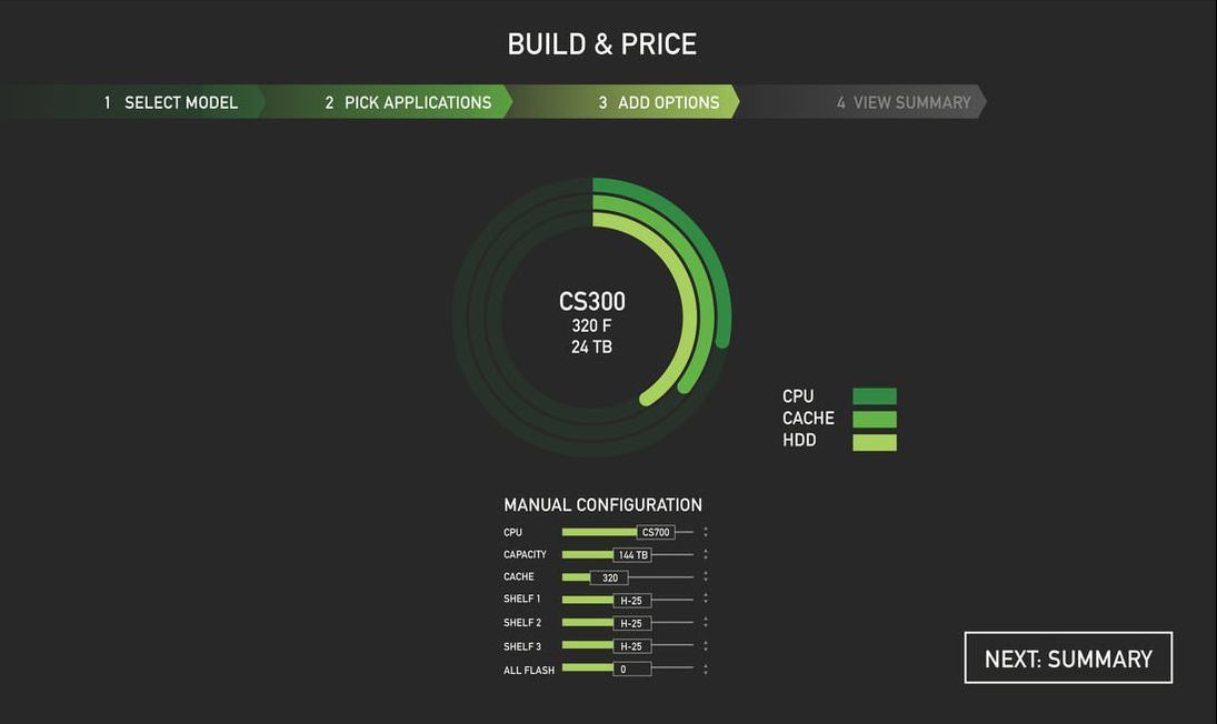
- User can customize the configuration using the "manual configuration tool-tip" on the top left side of the page
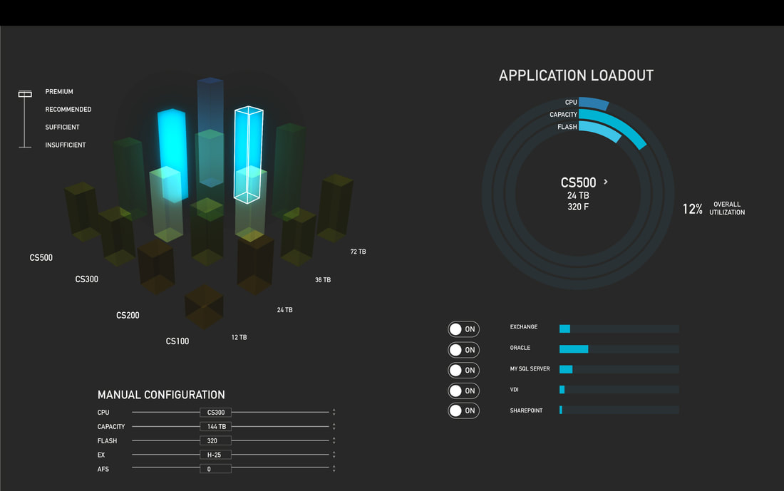
- User clicks the top recommended solution ( displayed in green in the 3D graph) . This will turn-on in real-time the circular graph for workload validation
- User switches off 2 applications using the switches next to the loading bars under the validation circular graph. The system recommends a configuration with less capacity and update in real-time the status of the configuration chosen by the user from "top recommended" (Green) to "less recommended" (Yellow)
- User clicks the workload tab on the top left to select a new workload
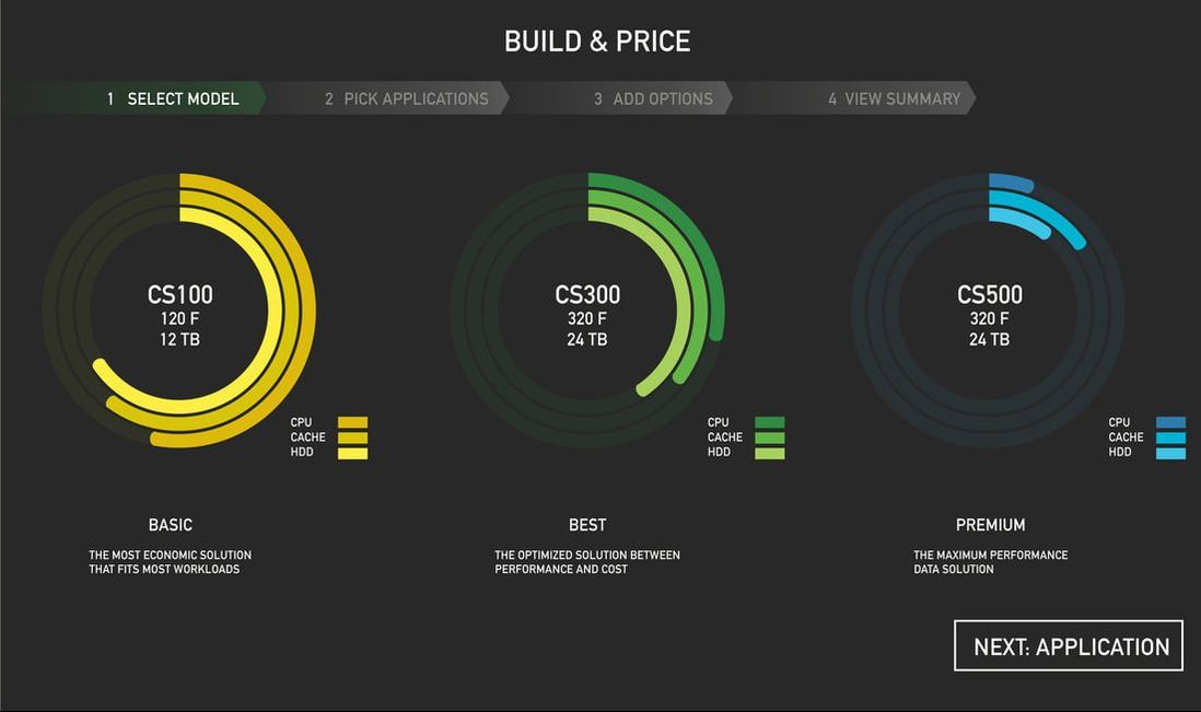
- User selects "workload 2." Since workload 2 is lighter than workload 1 the configuration chosen by the user is displayed as "premium" (Blue)
- User selects "workload 3." Since workload 3 is heavier than workload 1 the configuration chosen by the user is displayed as "Not Recommended" (Red)
- Users can save the scenario using the top right save button and they will be automatically prompted to the comparison page
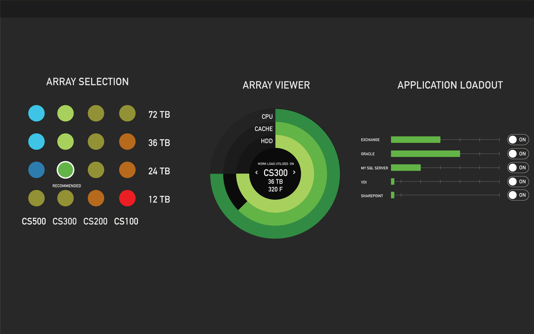
VISUAL EXPLORATION INTO A SALES WIZARD
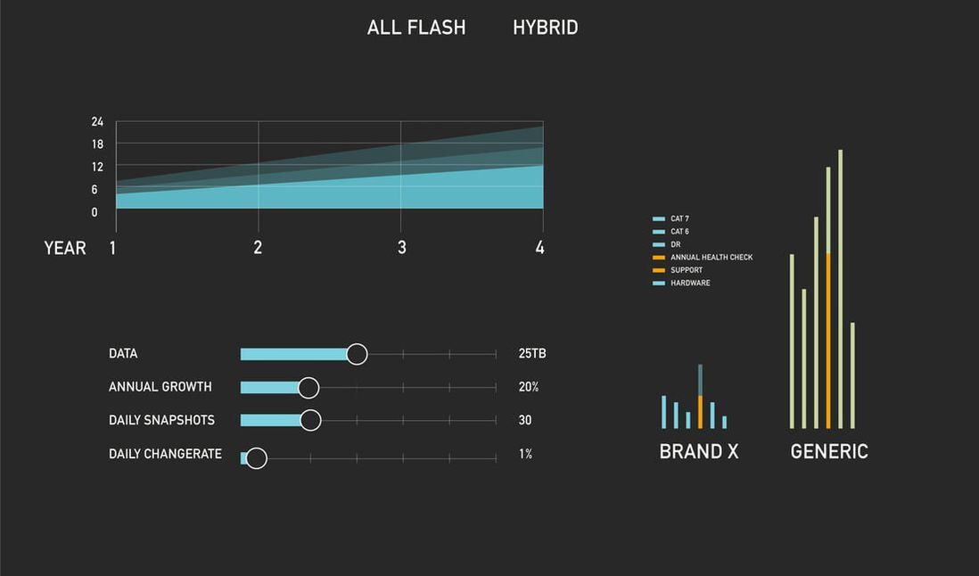
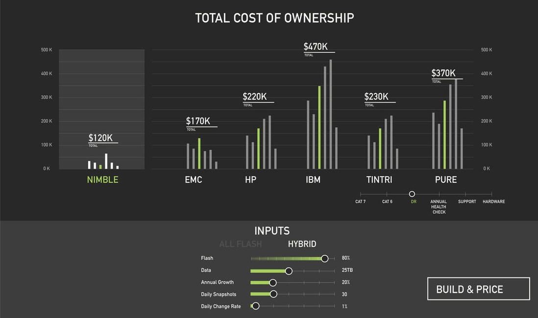
This was an experiment to explore a sales wizard for the client to use. This version became less desirable since the stakeholders preferred a design used by a sales associate to illustrate the best solution for their needs without giving the client too much information that they can use to cart to competitors.
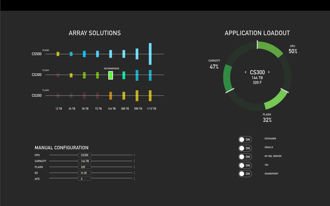
VISUAL EXPLORATION OF THE VALIDATION CIRCLE
While the sales wizard design was an exploration based on our more evolved design, the initial centralized view was started out at a very rudimentary stage.
This version of the array selection allows the a 3rd dimension being the magnitude of the flash level.
SALES VISUALIZATION FEATURE EVOLUTION
UX PROCESS
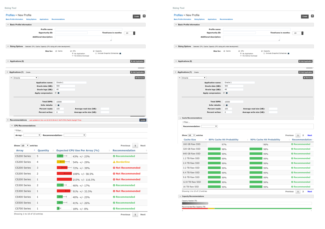
EXPLORING THE EXISTING UI
We started analyzing the existing UI. The interface consisted in a long page full of data and many toggles. The recommendation system would return a long list of results at the bottom of the page but the users to change values and update the results could do it only on the top of the page. One thing I really hated was the expected CPU visualizer. It doesn't make intuitive sense to describe a machines capabilities or insufficiency based on the "T" brackets. Together with the data scientist, the UX Lead and my partner Lucio, we went through all the platform and we start analyzing all potential changes to make this an easy to understand and have a fluid experience.
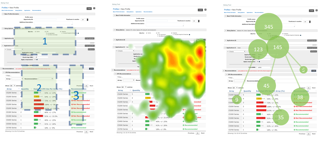
CLICK TRACKING STUDIES
After surveys and interviews, which were not conducted by me. This was done by the principle designer. He believed that users were often losing context and often they would not come back to this tool. To validate the findings and collect ideas, he and I organized several focus meetings with sales, partners and clients. I also worked with the internal development team including project management, engineering and the data scientists to refine the requirements and roadmap. I also used tracking tools, exploring user clicking behaviors and attention diagrams using eye tracking software. My role was to take this information and Lucio's conclusion and break down where people were getting lost and why. While Lucio approached this from a interview stand point, I wanted to explore it from a data-visualization standpoint.
We established a tiger team focusing on refreshing the GUI according to new requirements coming from sales. Following agile best practices we wanted to refresh the GUI design and interactions using a user-centric approach. Before meeting with the clients we organized several meetings with stakeholders including Sales directors, sales executives, channel partners and an internal engineering team. It was crucial to collect stimuli and precise feature requests using paper prototypes and wireframes. After a month of work we were able to craft the new requirements and flash out all the workflows. There were several personas and use cases, the complexity was resolved building interactive prototypes. Digital high fidelity prototypes allowed us to validate our assumptions quickly and efficiently.
STAKEHOLDER REQUIREMENT
Refresh the UX and UI to enhance usability
Reduce the amount of information displayed and number of clicks
Leverage real-time predictive analytics to stimulate interest and adoption
Provide sizing estimates using interactive visualization and animations
Design flexible interaction tools to manage the amount of information needed for sizing
Allow users to collect their submissions to enhance predictive performance.
Create a centralized platform including a TCO calculator and comparison tables.
Mark Tse
2016
2016
